Ricardo Valentim
The New Typography
March 22 - April 27, 2012
Andrew Roth is pleased to present “The New Typography,” a solo exhibition by Ricardo Valentim. The show is comprised of a series of lithographic plates, three sculptures, and a limited edition multiple published by PPP Editions.
Since 2006, Valentim has produced graphic materials, including leaflets, brochures, and posters, as part of his film screenings and lecture-based works. This printed matter functions as a supplement to the content conveyed in these screenings and lectures, but it also signifies the transformation of the immateriality of these works into a materialized form.
The New Typography
Jan Tschichold was a typographer, designer, and teacher, who in 1928 published the revolutionary text Die neue Typographie (The New Typography), which has long been recognized as the definitive treatise on the graphic design of the machine age. Perhaps because of its pedagogical tone, almost overnight, typographers and printers adapted Tschichold’s approach to typography to a huge range of printed matter, from business cards and brochures to magazines, books, and advertisements. As a manifesto on Modernist design, the book condemned all typefaces except sans-serif, promoted standardized paper sizes, and proposed using different sizes and weights of type in order to most efficiently enable readability.
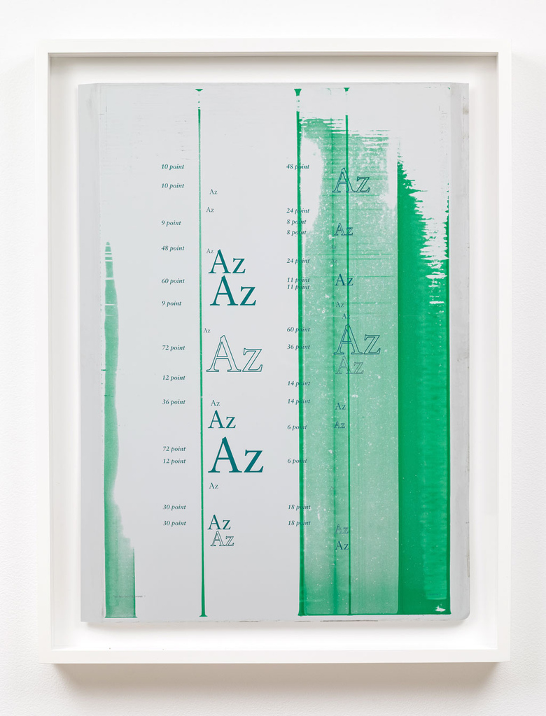
From the turn of the century until the '70s, type foundries designed and distributed typefaces through what were known as type specimens, documents showcasing letterpress type to designers and printers. For over a year, Valentim has been collecting these type specimens. His interest lies in the ways in which they reveal structures of representation and communication. While typefaces usually function as vehicles to present ideas and content, in the case of type specimens this form is inverted: the ideas and content (i.e. words and texts) are used as vehicles to present typefaces.
“The New Typography” is based on a variety of sources. It introduces an anachronic approach to the works on view, suggesting a quasi-fictional history of typography. Its title departs from the title of Tschichold’s book, as well as the title of the 2010 exhibition at the Museum of Modern Art, which displayed graphic works that attested to the widespread dissemination of Tschichold’s teachings. Through this exhibition, Valentim draws a subjective relationship between the two, relating the role played by an educational text that greatly influenced the production of graphic arts with the role played by an institution, which consolidated this history through its displays of printed matter. The production of graphic specimens, as in Tschichold’s book, and its presentation, as in the MoMA exhibition, inform the entire aesthetic experience of “The New Typography” at Andrew Roth Gallery.
Lithographic Plates
Tschichold eventually acknowledged how rigid some of the ideas in Die neue Typographie were, and from the '30s onwards, he returned to Classicism in print design. He even designed typefaces with serifs, such as Sabon, which he created in the '60s . In fact, the photolithographic aluminum plates on view in this exhibition were used to print Sabon specimen broadsheets in 2011. While the prints themselves are not displayed in the exhibition, the plates that produced them are, drawing attention to the labor underlying their manufacture, as well as the entire apparatus within which they were produced.
Sculptures
Plate XII, Plate XVIII, and Plate XXIX are unique displays for a range of type specimens including Annonce Grotesque, Signal Black, Reiner Script, and Clearface Extra Bold, among others. Indeed, these examples form part of the history of typography and they have been widely used in the US and Europe as devices of communication since the middle of the twentieth century. They are presented on Exhibit Grafikas (model 2200DS) display pedestals specifically designed for exhibiting printed matter for this exhibition.
Limited-edition Multiple
The New Typography is a specimen published by PPP editions in 2012 that demonstrates how Sabon would look in various sizes and weights on different papers. Traditionally, designers used specimens to determine the legibility of typefaces in different contexts. The New Typography challenges the conventional form of type specimens through the production of a different specimen format, which expands standard compositional layouts and offers diverse modes for engaging with them.
Ricardo Valentim (born in 1978, Loulé, Portugal) lives and works in New York. He is best known for his film screenings and lecture pieces, but works across a variety of media, including radio, printed matter, photography, and sculpture. His work has been shown in many international venues including Galeria Luisa Strina, São Paulo; Manifesta 7, Trentino – South Tyrol; Statements/Art Basel 38, Basel; and Frac Île-de-France / Le Plateau, Paris. Last year, he co-edited the artist’s book Activity, with Pedro Barateiro, as part of the Christoph Keller Book Series for JRP | Ringier, Zurich; he was also awarded the first Heineken-Centro de Arte Dos de Mayo Award in Madrid. Valentim is currently preparing his first solo museum exhibition, slated to open in April at the Fundação de Serralves Museum of Contemporary Art, in Porto, Portugal.